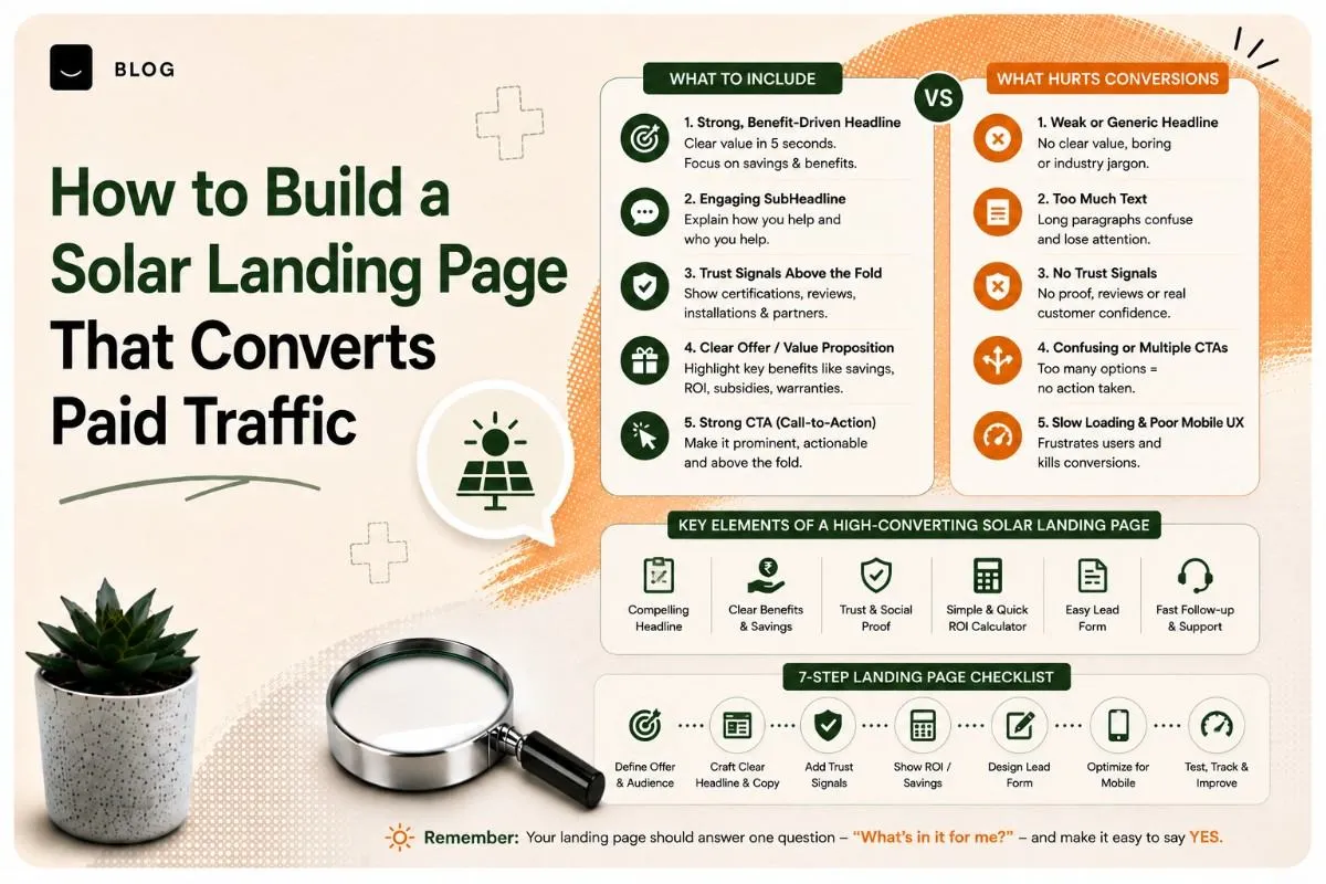
How to Build a Solar Landing Page That Converts Paid Traffic
A solar landing page converts when it answers the three questions every solar buyer has — what will it cost me, what will I save, and can I trust you — above the fold, and asks for as little information as possible in return. Most solar campaigns underperform not because the ads are bad, but because expensive clicks land on a page built to describe the company rather than to convert a lead.
Solar clicks are among the more expensive in local advertising. A page that converts at a low rate doesn't just underperform — it makes the entire channel look unviable when the real problem is the destination.
Why sending solar ads to your homepage wastes money
Your homepage exists to serve everyone: existing customers, job seekers, suppliers, people researching your company. A landing page exists to serve one person who just clicked one ad about one thing.
Three specific failures happen when you send paid solar traffic to a homepage:
Message mismatch. The ad said "rooftop solar for homes — get a free quote." The homepage says "Powering a sustainable future." The visitor has to work out whether they're in the right place, and a meaningful share won't bother.
Too many exits. A homepage has a full navigation menu, service links, an about page, a blog. Every one is a route away from converting.
No single ask. A landing page should have one job. A homepage has twelve.
What a solar buyer needs to see, in order
Solar is a considered, high-value purchase with a long decision cycle. But the landing page moment is short — you have seconds to establish relevance before the back button.
The order that works matches the order the buyer thinks in:
- Am I in the right place? — the offer, restated from the ad
- What's this going to cost me? — the question they're actually there for
- What will I save? — the reason they clicked
- Can I trust these people? — proof
- What happens if I enquire? — reassurance about the next step
- How do I do it? — the form
Pages that lead with company history and put the form at the bottom have this backwards.
The anatomy of a solar landing page
1. Headline that matches the ad
The headline should restate the ad's promise almost literally. If the ad targeted "solar for homes in [city]", the headline should say rooftop solar and name the city. This single alignment does more for conversion than most design work.
Below it, a one-line subhead that adds the specific: system types, service area, or the offer.
2. The savings question, answered honestly
Every solar buyer wants to know what they'll save. Most solar pages either dodge this entirely or make claims they can't support.
The honest approach converts better than either. Explain what determines the savings — roof size and orientation, current consumption, tariff, system size — and either provide a calculator or offer a personalised estimate as the thing the form delivers. "We'll tell you exactly what you'd save on your roof" is a stronger offer than a generic percentage nobody believes.
VERIFY: Any savings figures, payback periods or generation estimates published must be defensible and clearly caveated. Do not publish an illustrative number as if it were a guarantee — it's both a trust problem and a potential misleading-advertising issue.
3. Proof that you've done this before
Solar is a large purchase from a category with a reputation problem in many markets. Proof matters more than in most verticals.
What actually works: photos of real installations you've completed, ideally locally recognisable. Number of installations completed. Certifications and empanelment. Warranty terms stated plainly. Genuine customer reviews with names and locations. Brand names of panels and inverters you use.
What doesn't: stock photography of unrelated roofs, vague claims like "trusted by many," and testimonials with no attribution.
4. The form — shorter than you think
The most common conversion killer on solar landing pages is a form asking for ten fields including full address, monthly bill amount, roof area and preferred system size.
Ask for the minimum needed to make the next contact: name, phone number, and city or pincode. That's usually enough. Everything else — bill amount, roof details, timeline — is a conversation for the callback, where a human can ask it naturally and the prospect is already invested.
If you genuinely need one qualifying field, make it monthly electricity bill as a range with tappable options, not a typed number.
5. Objection handling
Answer the objections on the page rather than leaving them to kill the conversion silently:
- "Is my roof suitable?" — explain what makes a roof suitable, and that you'll assess it
- "What about maintenance?" — state what's involved and what you cover
- "What if I sell the house?" — address it plainly
- "How long does installation take?" — give a realistic range
- "What happens in monsoon / cloudy weather?" — answer honestly
- "Is the subsidy real and will you handle the paperwork?" — a major practical concern
A short FAQ block near the form handles all of these and doubles as AEO-friendly content if the page is also indexable.
6. A single, repeated call to action
One action, repeated down the page — after the headline, after the savings section, after proof, after the FAQ. Same wording each time.
Make it specific about what happens next. "Get a free rooftop assessment" beats "Submit." The buyer is agreeing to a defined thing, not handing over a phone number to an unknown process.
The subsidy and financing question
In India, subsidy and financing questions are often the deciding factor, and they're where solar pages most commonly go vague.
Address three things plainly: what support exists, whether the buyer is likely eligible, and whether you handle the paperwork. That last point is a genuine differentiator — most buyers would rather pay slightly more than navigate a subsidy application themselves.
VERIFY: Subsidy scheme names, amounts, eligibility criteria and application processes change. Verify every specific against the official source at time of publishing, and date the information on the page. Publishing outdated subsidy details is actively harmful — it sets a customer expectation you cannot meet.
Similarly for financing: if you have loan tie-ups, say so and name them. If you don't, don't imply it.
Speed and mobile: where most solar pages lose the lead
Most paid solar traffic arrives on mobile, frequently on an average connection. Two things follow.
Page weight matters. A page loaded with high-resolution installation photography, an embedded video and three tracking scripts will be slow, and slow pages lose paid visitors before they render — you've paid for the click and shown them nothing.
Compress images properly, lazy-load anything below the fold, and test on a genuinely slow connection rather than office wifi.
The mobile layout is the real layout. Check that the form is reachable without excessive scrolling, that the phone field triggers a numeric keypad, that tap targets are large enough, and that nothing important sits behind a hamburger menu. Design the mobile view first and let desktop follow.
Adding a click-to-call button is often the highest-return single change on a solar landing page — a meaningful share of buyers would rather call than fill in anything.
One page per campaign, not one page for everything
If you run separate campaigns for residential and commercial solar, they need separate pages. The buyers are different people with different questions — a homeowner asks about monthly bills and subsidy; a factory owner asks about capex, ROI and downtime during installation.
The same applies to distinct geographies if your messaging or pricing differs. Message match is the highest-leverage variable in paid landing pages, and one page serving three campaigns matches none of them well.
What to test first
Test in order of likely impact, one change at a time:
- Headline message match against the ad
- Form length — try removing a field
- The offer itself — "free quote" vs "free rooftop assessment" vs "see your savings estimate"
- CTA wording
- Proof placement — moving installation photos and reviews higher
- Click-to-call prominence on mobile
Run each test long enough to gather meaningful data before concluding. Solar lead volumes are often modest, so a test that "wins" after nine conversions hasn't proven anything.
A pre-launch checklist
- Headline matches the ad's promise and names the service area
- The cost/savings question is addressed above the fold
- Real installation photos, not stock
- Certifications, warranty and panel/inverter brands stated
- Genuine reviews with attribution
- Form has three fields or fewer
- Click-to-call button visible on mobile
- Subsidy and financing addressed, with a last-updated date
- Objection FAQ near the form
- One CTA, repeated, with specific wording
- Navigation removed or minimised
- Page tested on a slow mobile connection
- Conversion tracking configured and verified with a test submission
- Thank-you page set up, with clear next-step expectations
That last item gets skipped constantly. If conversion tracking isn't verified, you're optimising a campaign on data you can't trust.
Conclusion
Solar advertising works when the page respects why the click happened. Answer the cost question, prove you've done it before, ask for three fields, and make it fast on a phone. Most of the gap between a solar campaign that works and one that doesn't sits on the landing page, not in the ad account.
Want a solar landing page built and tested against your actual campaigns?
Contact Crescent for a free consultation.
Frequently asked questions
A homepage serves many audiences and offers many exits, while a landing page serves one visitor who clicked one ad. Sending paid solar traffic to a homepage creates message mismatch with the ad, offers numerous routes away from converting, and lacks a single clear call to action.
Three or fewer is usually right — name, phone number, and city or pincode. Details such as monthly bill, roof area and timeline are better gathered during the callback, when a person can ask them naturally and the prospect is already engaged. If one qualifying field is essential, use a tappable bill range rather than a typed number.
Explain what determines savings — roof size and orientation, current consumption, tariff and system size — and offer a personalised estimate as what the form delivers, rather than publishing a generic percentage. Any illustrative figures must be defensible and clearly caveated rather than presented as guarantees.
No. Homeowners and commercial buyers ask different questions — monthly bills and subsidy versus capital expenditure, return on investment and installation downtime. Message match is the highest-leverage variable in paid landing pages, and a single page serving multiple campaigns matches none of them well.
Asking for too much information in the form, typically eight to ten fields including full address, bill amount and roof details. This is the most frequent conversion killer, alongside slow-loading pages caused by heavy installation photography reaching visitors on average mobile connections.
Ready to build what's next?
Tell us where you're headed. We'll come back with a plan to get there.
Book an intro call